How to create a design system with Claude Code
How to create a design system with Claude Code is a playbook on having Claude Code build a design system in Figma before any code is written, or from an existing app's code (semantic variables in Light and Dark modes, contrast checks, text styles, components with states, code names and written rules), design new screens from it, audit it and keep it in sync with the app, shown on the Coral Mac and iPhone app.
Coral (opens in a new tab), my Mac and iPhone app for answering coding agents, has a design system in Figma: its colors, type and components in one file. Claude uses it every time it designs a new screen. My advice is to build yours in Figma before you write any code, so every screen after it is put together from parts you've already decided on. This is how to set it up, how to check it, and where Coral's still falls short.
What is a design system?
A design system, in Figma's words (opens in a new tab), is "a set of building blocks and standards that help keep the look and feel of products and experiences consistent." In a Figma file, that means variables for colors, spacing and radii, text and effect styles, components with their states, and written rules for using them.
Why build it before code
A design system built first makes every screen after it faster and more consistent to make:
- Screens are put together, not drawn. In a Figma study (opens in a new tab), designers with a design system finished their task 34% faster than without one. Figma notes that's likely the most a team would save, since the system matched the task.
- Decisions are made once. Which grey, which type size, which radius: settled in the system, so no screen picks its own. With an agent drawing the screens, that matters even more.
- States come built in. Hover, pressed, empty and error live in the component, so every screen that uses it has them.
- Light and Dark take one switch. Variables have a mode for each, so each screen is designed once and checked in both.
- Accessibility is checked once. Contrast is fixed at the color, and every screen inherits the fix.
- One change updates every screen. Instances stay linked to their main component.
- The code starts from your names. When each token carries its name in code, the agent writing the code uses your names and your components instead of guessing.
A color or a missing state is cheaper to change in a frame than across shipped code. You can still build a system from an existing app's code, which is how Coral's was made, because the app already existed. Step 1 covers both.
The steps
- 01
Set up the file before any screens.
- 02
Name colors by their job, with a Light and a Dark mode.
- 03
Check contrast in both modes.
- 04
Put type and shadows in styles.
- 05
Turn repeated parts into components, states included.
- 06
Write the rules down where Claude reads them.
- 07
Design every screen from the system.
- 08
Audit every new section.
- 09
Link each token and component to its name in code.
- 10
Keep the file in sync with the app.
1. Set up the file before any screens
Start with three things: a Foundations page for colors and type, a Components page, and a Read me that says which variables and styles to build from. A prompt like this one does it. It's a template:
Set up a design system in Figma, in <Figma file link>, before any screens or code. - One variable collection with Light and Dark modes. Name each color by its job (text/secondary, not grey-62), and set scopes. - Text styles for type and effect styles for shadows. - A component for every part that will appear on more than one screen. States are variants, text and optional parts are properties. Bind every fill, radius and gap to a variable and every text layer to a text style. Put the spec and behaviour in each component's description. - A Foundations page, and a Read me that says which variables and styles to build from.
Already have an app? Build the system from its code instead, so the file and the app start out the same. That's how Coral's was made: its SwiftUI views already existed, so I asked Claude to rebuild them in Figma as variables, styles and components. The Mac components frame says what it maps to: the views in app/Coral/Island, with Theme.swift and QueueParts.swift. The prompt for that, also a template:
Build a design system in Figma from this app's code, in <Figma file link>. Read the theme file and the shared views first. - One variable collection with Light and Dark modes. Name each color by its job (text/secondary, not grey-62), use the values from the code, set scopes, and set the iOS code syntax to the Swift name. - Text styles for type and effect styles for shadows. - A component for every view used on more than one screen. States are variants, text and optional parts are properties. Bind every fill, radius and gap to a variable and every text layer to a text style. Put the spec and behaviour in each component's description. - A Foundations page, and a Read me that says which variables and styles to build from. At the end, list anything in the code you couldn't map.
2. Name colors by their job, with Light and Dark modes
Colors live in one variable collection, Coral, with two modes: Dark and Light. Each variable is named for what it does, not how it looks: text/secondary, not grey-62. Apple says the same about its system colors, which are "semantically defined by its purpose, rather than its appearance" (opens in a new tab).
canvas/*: backgrounds, grouped surfaces and separators. These change between Dark and Light.text/*: primary, secondary and tertiary text.island/*: the black island and what sits on it.status/*: blue for working, amber for needs you, green for done. Color only ever means state.action/*andglass/*: buttons, the destructive red, and glass fills.
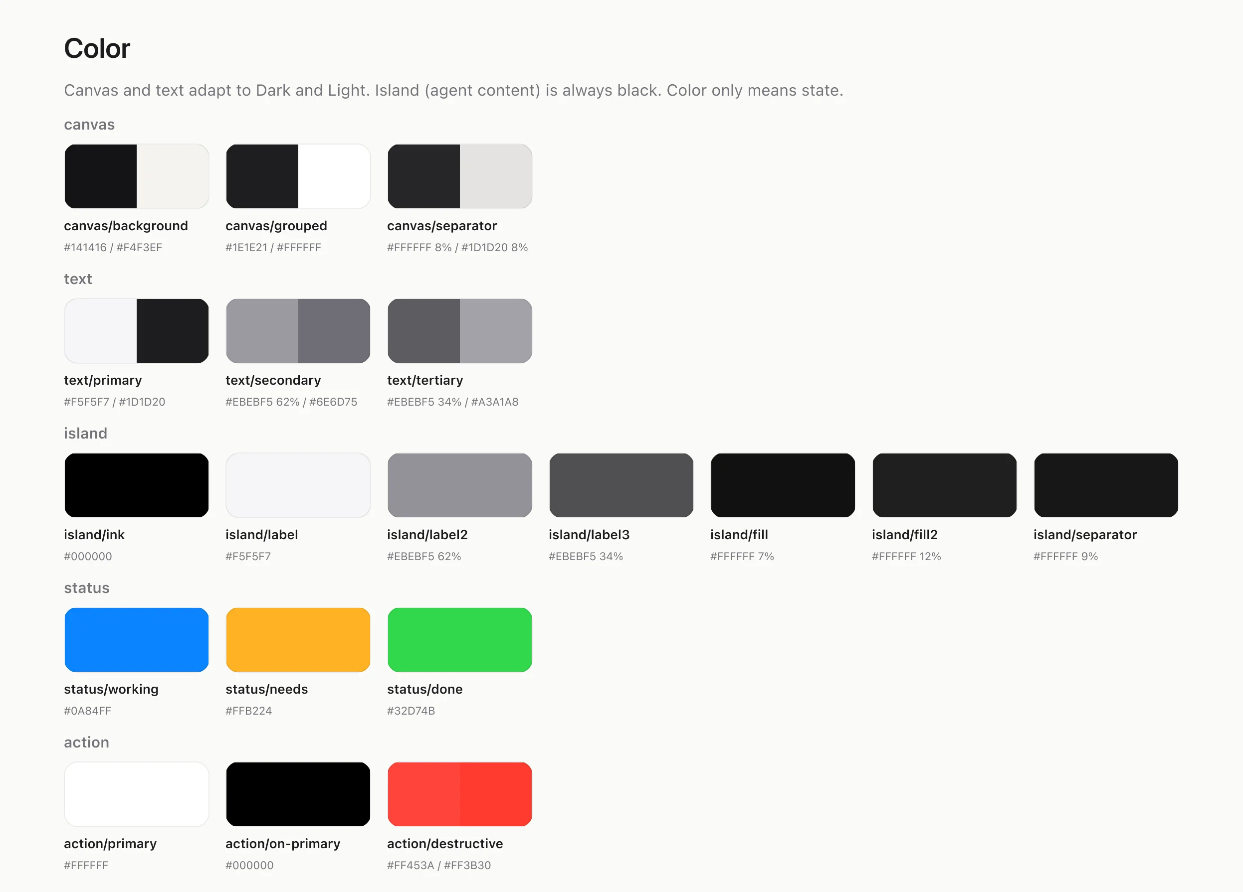
Spacing and corner radii are variables too, from space/4 to space/32 and from radius/keycap to radius/sheet. That's 39 variables in all. Coral has no separate layer of raw palette colors under these names, which bigger systems often add. The hex values sit in the semantic variables directly.
Every variable has a scope, so Figma only offers it where it fits (Create and manage variables (opens in a new tab)). canvas/separator is scoped to shapes and strokes, so it never shows up as a text color. That's the exact misuse Apple's color guidance warns about.
3. Check contrast in both modes
Two modes means every text color gets checked twice. I had Claude work out the WCAG contrast of each text and background pair from the variables' values, in Dark and in Light. AA needs 4.5:1 for body text and 3:1 for large text.
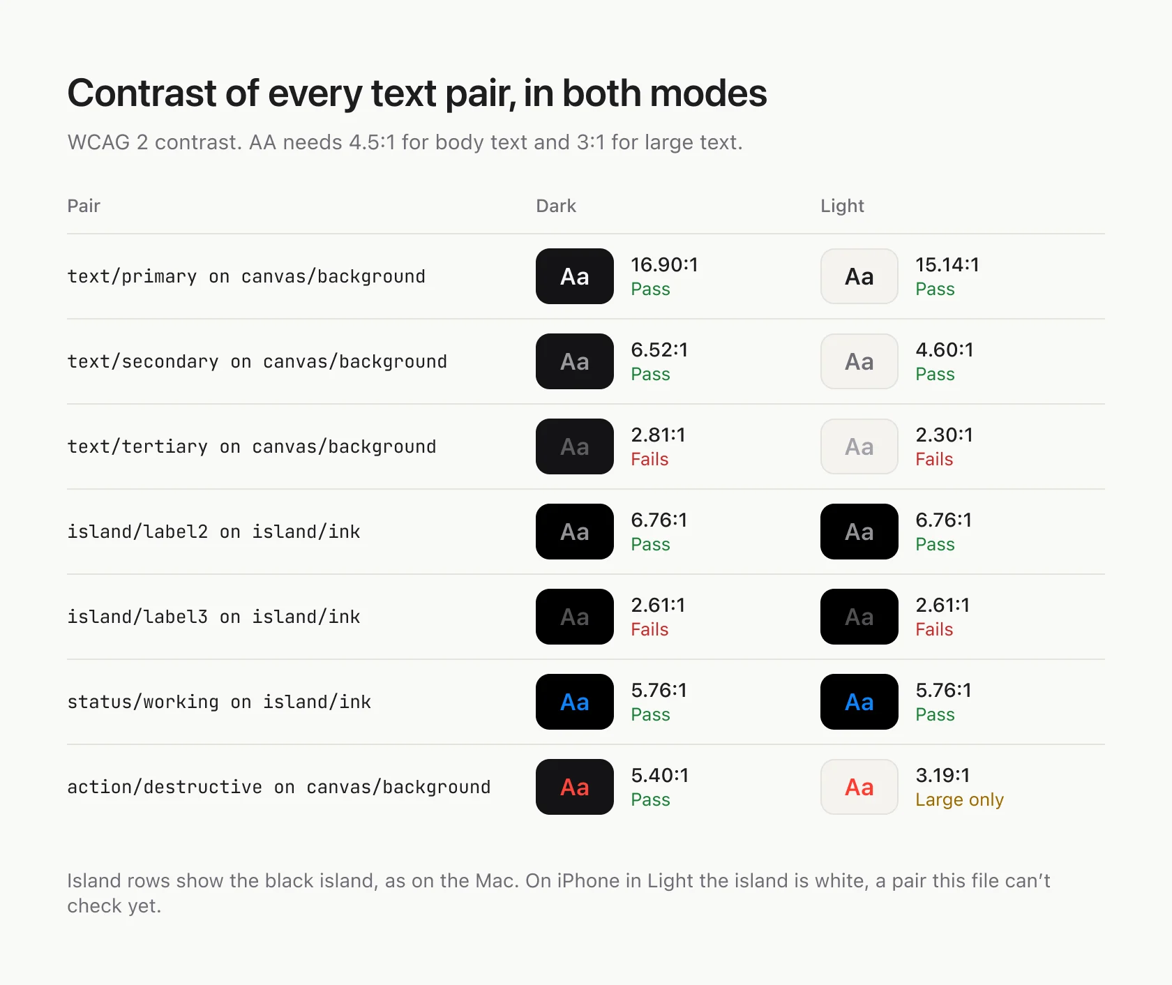
Most pairs pass. text/tertiary and island/label3 fail in both modes, at 2.3 to 2.8:1, and the destructive red only passes for large text in Light.
Apple asks for one more thing: for custom colors, "supply light and dark variants, and an increased contrast option for each" (Color (opens in a new tab)). Coral's collection has no Increase Contrast mode yet.
4. Put type and shadows in styles
A variable holds one value, like a color or a number. A text style holds a font, size, weight and line height together, so type lives in styles. Figma's docs list what variables can and can't hold (Apply variables to designs (opens in a new tab)).
Coral has 15 text styles, from Coral/Large title to Coral/Mono, named by role: Question, Task, Option, Metric. They're SF Pro, with JetBrains Mono standing in for SF Mono. Shadows and glass are 3 effect styles.
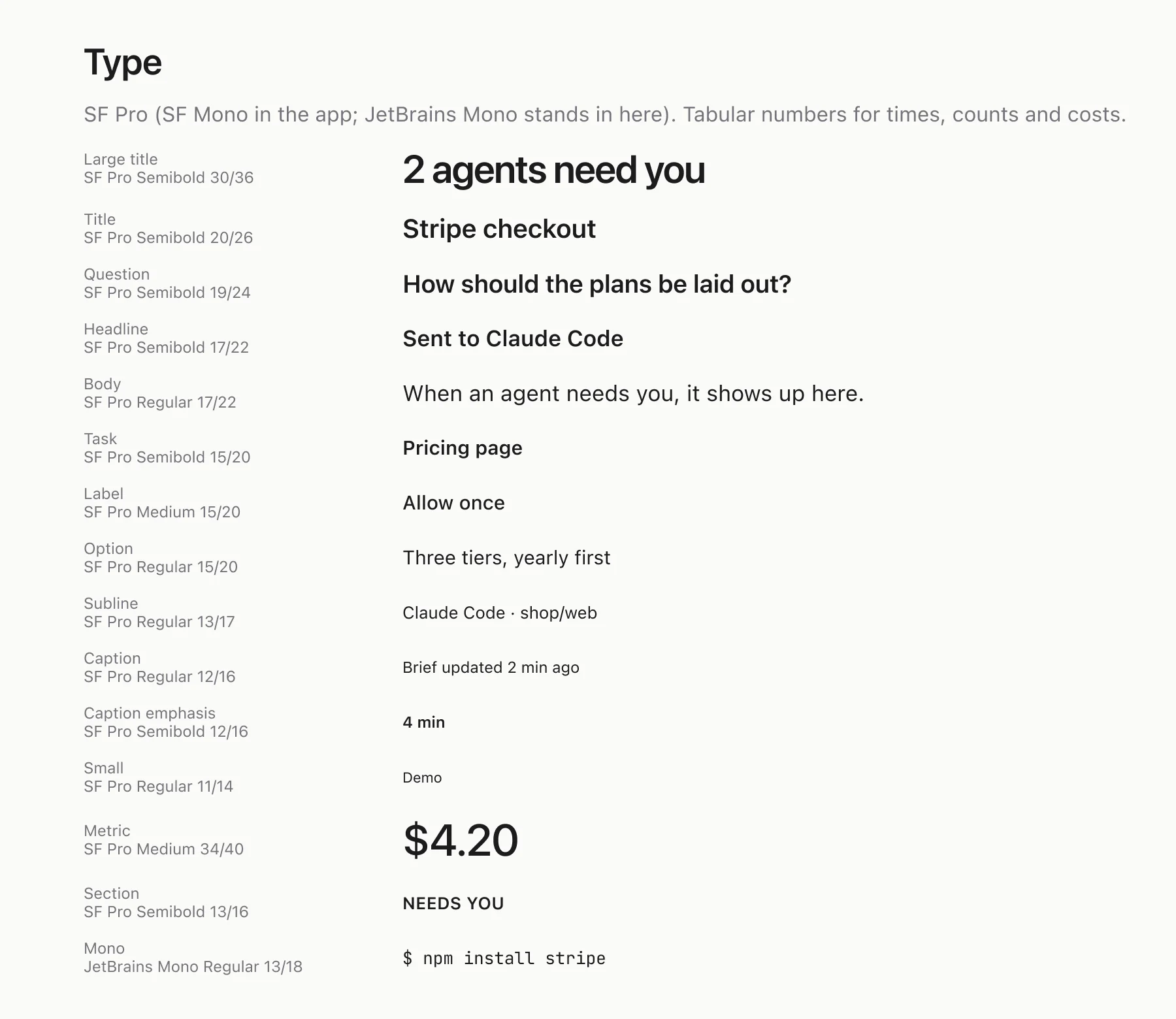
Figma shows each style at one size. On iPhone, the code uses Apple's text styles, like .title and .body, so type grows with the reader's Dynamic Type setting. The Figma sizes are the default size, not the only one.
5. Turn repeated parts into components, states included
Anything that shows up on more than one screen is a component. Its states are variants, and its text and optional parts are properties.
Avatar: State is Working, Needs you, Done or Idle, with an instance swap for the agent's icon.Mac/Option row: State is Default, Hover or Pressed, with Label and Detail text and a Show detail toggle.Mac/Button: Style is Primary or Secondary, with a Shortcut and a Show shortcut toggle.Companion: 10 animals, each with 6 expressions.

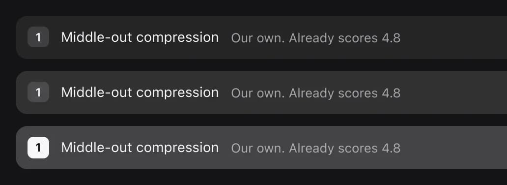
Names use slashes, so Mac/Button sits in a Mac folder in the assets panel (Create and use variants (opens in a new tab)). Shared parts, like agent icons, avatars and the companion, are on a Components page. Mac-only parts are in a Mac components section. Each component has a description with what a picture can't show: Mac/Option row's says the whole row is the click target, and pressed means a brighter fill and a 0.985 scale.
The happy path isn't enough. Coral's file also has screens for when there's nothing to do, when something fails and when the phone is offline:
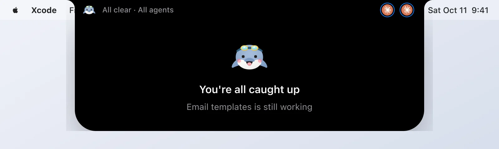
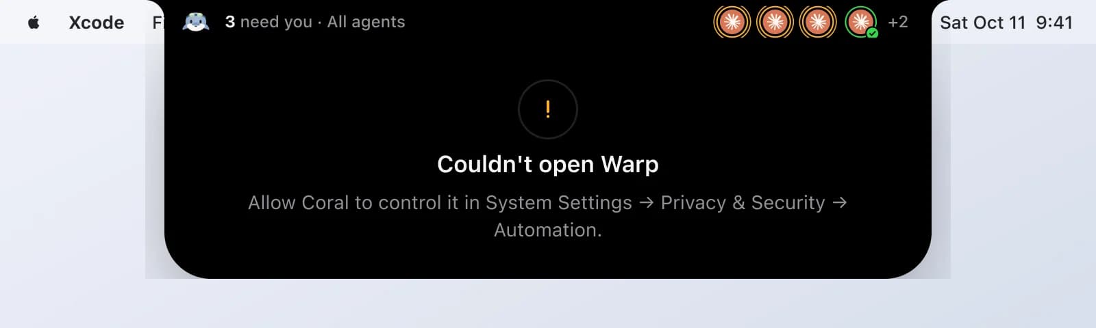
The components themselves are thinner. No component has a Disabled state, so a disabled button or option row would have to be drawn by hand.
One-off parts stay out of the library. Brad Frost's components, recipes and snowflakes (opens in a new tab) is a good test for what belongs in it.
6. Write the rules down where Claude reads them
Parts aren't enough. Claude also needs the rules for using them, and in Coral they live in two places:
- In the Figma file. The Foundations page has notes like "Color only means state" and "Blue is never a tint: it means working." The Mac App page starts with a 0 · Read me section on how the page is organized and which variables and styles to build from.
- In Claude Code's memory. How I want screens designed: Light and Dark, a note under every frame, accessibility, options with a pick. Those are in My method for designing new screens in Figma.
Figma gives the same advice for agents: rules should say which components to use and "what should never be hardcoded" (Add custom rules (opens in a new tab)).
7. Design every screen from the system
When Claude designs a new screen, it starts from instances of these components, not new rectangles. Section 36 · Side edge, the design from the other guide, has 222 instances of 11 components, including Mac/Menu bar, Mac/Island shoulder, Mac/Option row, Avatar and Companion.
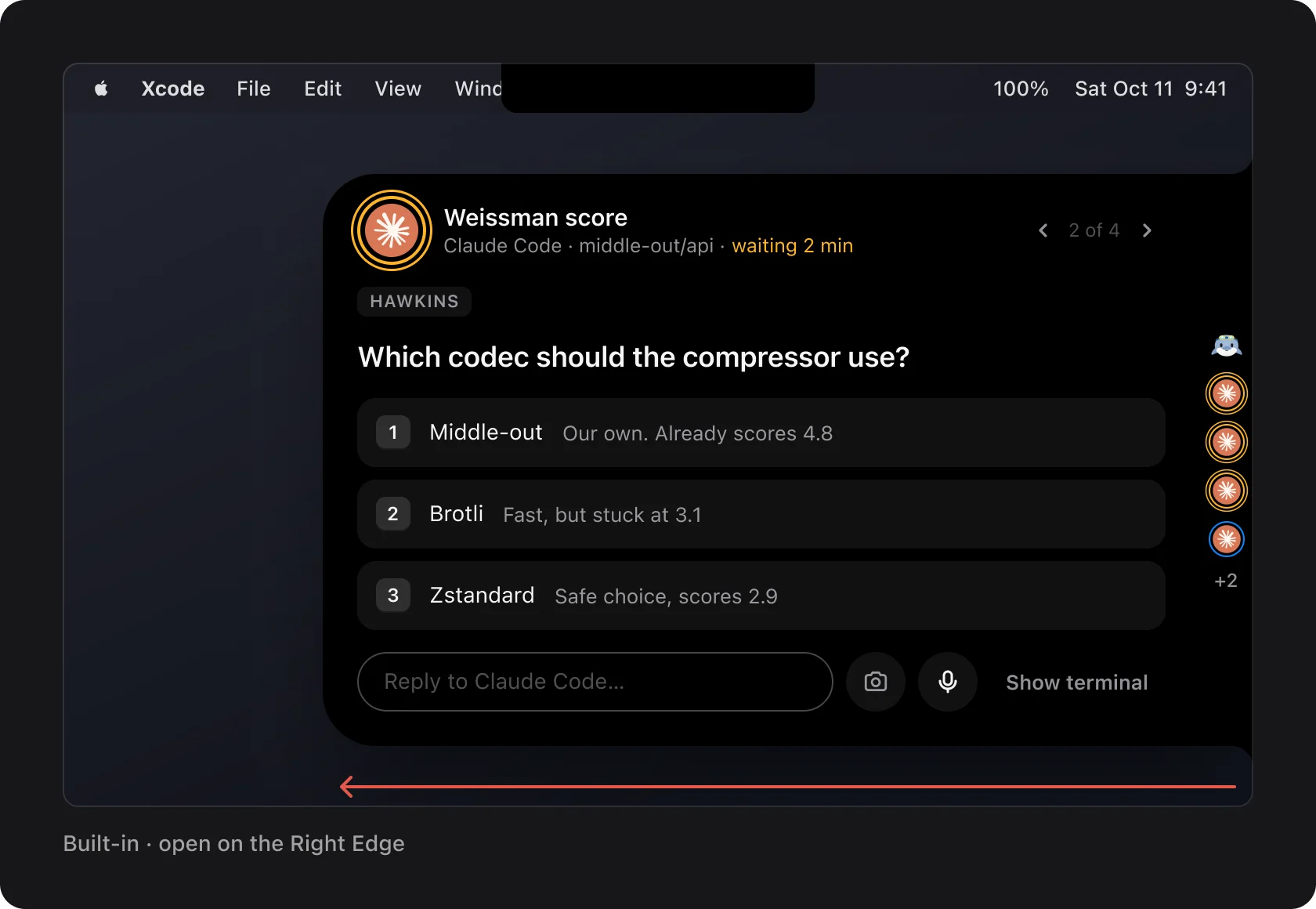
Instances stay linked. Change the main component and every screen that uses it changes too. Detaching breaks that link: Salesforce counted (opens in a new tab) more than 3,000 detaches of a single button icon in a year.
8. Audit every new section
Using instances isn't the same as using the system. While writing this guide, I had Claude count what's actually linked in four parts of the Mac App page:
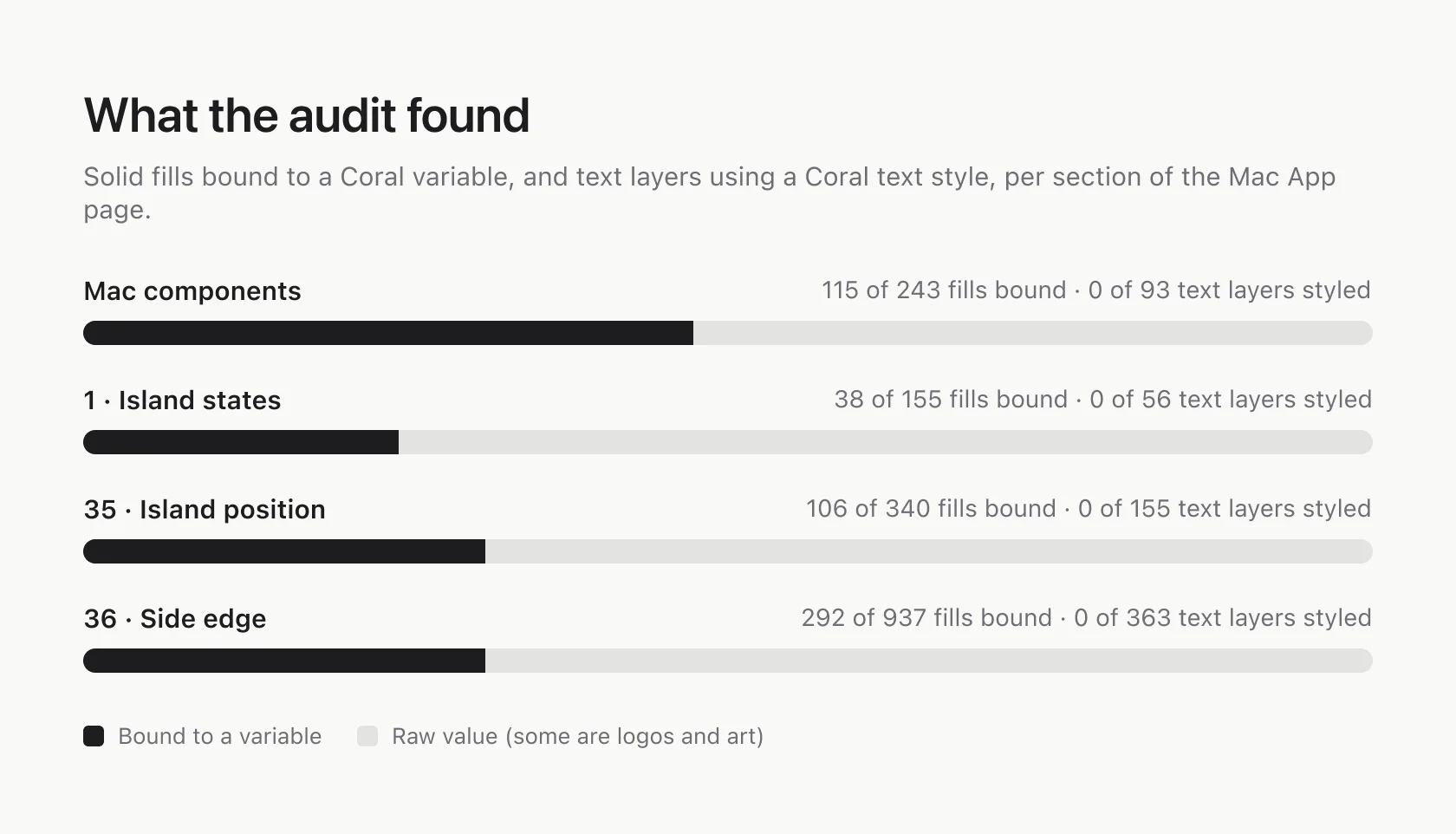
No text layer uses a text style, not even inside the components. Only about a third of the fills are bound to a variable. Some of the rest are agent logos and companion art, which should stay raw. I haven't sorted out how many.
My guess, not tested: the raw values come from Claude copying layers out of earlier frames, which brings their values along, instead of picking from the variables. Fixing the components first fixes every screen that uses them, so that's where the audit starts. After that, it runs at the end of every new section:
Audit section <name> in the Figma file. Count the fills not bound to a variable, the text layers without a text style, and any detached instances. Bind what should be bound. List what should stay raw, like logos and illustrations, and why. Then check every text and background pair in Light and Dark against WCAG AA.
9. Link each token and component to its name in code
Every Figma variable should carry the name the code uses. Figma has a field for it, code syntax, with a name per platform (Create and manage variables (opens in a new tab)). With it, Claude reading a frame gets Theme.canvasBackground, not just a Figma name it has to guess from.
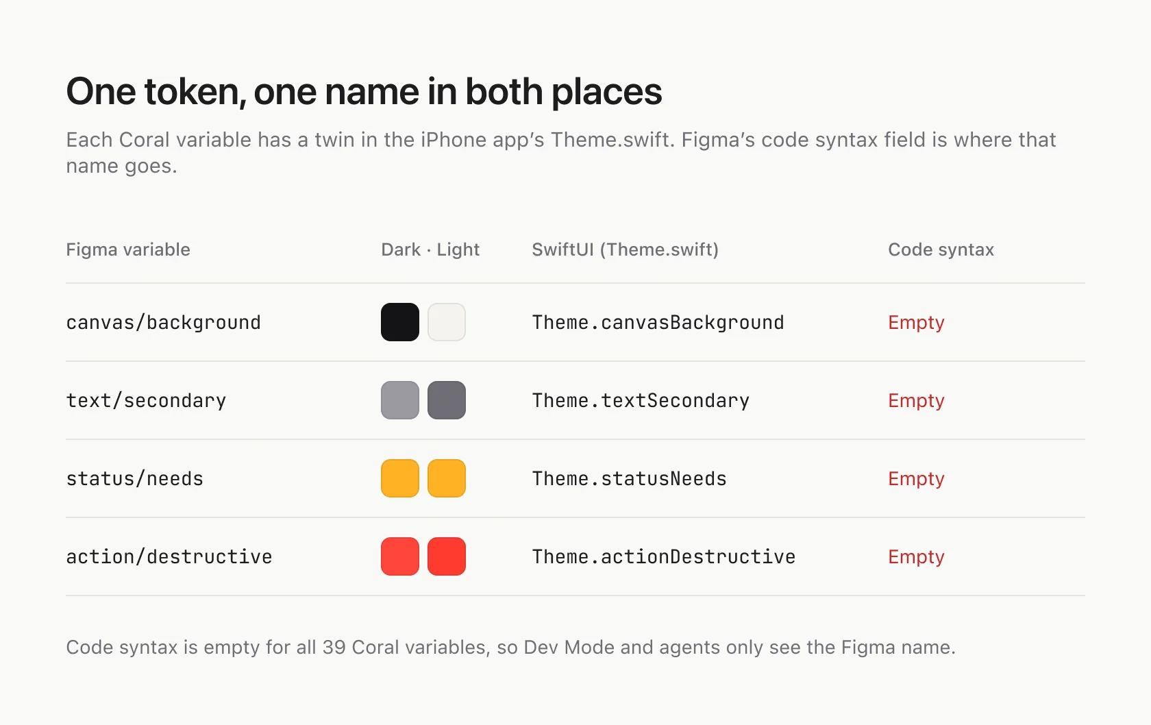
Components get the same treatment through Code Connect, which maps a Figma component to the component in your code. Figma calls it the most effective way to get agents to reuse your real components (Structure your Figma file (opens in a new tab)). Coral has neither yet: code syntax is empty for all 39 variables, and there's no Code Connect.
10. Keep the file in sync with the app
A design system in Figma is only useful while it matches the app. Coral has a rule for it: when the UI changes, the Figma file changes too. Comparing the two while writing this showed where that rule slipped.
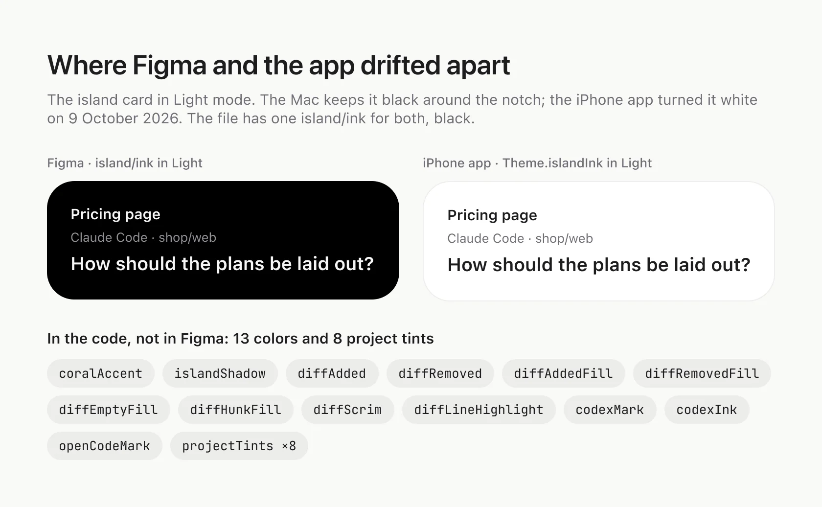
On the Mac, the island stays black around the notch. On iPhone, it turned white in Light mode on 9 October 2026. The file still has one island/ink, black in both modes, and the Foundations note still says the island is always black. The code also has 13 colors and 8 project tints the file doesn't, mostly from the diff view.
A prompt for after a UI change:
I changed <feature> in the app. Compare the theme in code with the Figma variables, and the changed views with their Figma components. Update the file to match what shipped, and list every value that was different.
Where Coral's system stands
- Working: semantic variables with Light and Dark modes and scopes, text and effect styles, components with variants and descriptions, written rules, and new screens built from instances.
- Not yet: text styles linked to text layers, most fills bound to variables, code syntax, Code Connect, Disabled states, an Increase Contrast mode, readable tertiary text, and a separate island color for iPhone.
Questions
Do I need a designer to build a design system in Figma?
Coral's was built by Claude, from the app's SwiftUI code, through Figma's MCP server. The setup is in How to set up Figma MCP with Claude Code.
Variables or styles?
Both. Variables for single values: colors, spacing, radii. Styles for things made of several values: text, shadows and glass.
How many modes can a collection have?
Coral uses two, Dark and Light. Figma's Professional plan allows up to 10 per collection and Organization up to 20 (Figma plans and features (opens in a new tab), checked 29 October 2026).
Should I start from Apple's Figma kits?
For system parts, yes. Apple publishes Figma kits for iOS and macOS, with SF Pro and SF Symbols, on Apple Design Resources (opens in a new tab). Coral's iPhone chrome, like the status bar and tab bar, comes from Apple's iOS library. Its own parts are what go in the design system.