My method for designing new screens in Figma before I build them
My method for designing new screens in Figma before I build them is a playbook on asking Claude Code to design a new screen in Figma first, letting it work out the states and edge cases, comparing options by their weak spots, and building from the finished frames, shown on a real feature in the Coral Mac app.
When a feature needs a new screen, I don't let Claude write the code first. I ask it to design the screen in Figma, I review the frames, and only then does it get built. A frame is quicker to review and to change than code that's already wired up.
The example all the way through is real: docking the island in Coral (opens in a new tab)'s Mac app on the side of the screen, designed on 29 October 2026. Coral shows your coding agents' questions in the island, a black shape around the MacBook notch.
The steps
- 01
Give Claude your design system and your rules.
- 02
Ask for the screen in a line, and ask for it in Figma.
- 03
Let Claude design it, cases and all.
- 04
Pick between options by their weak spots.
- 05
Build from the frames and the notes.
1. Give Claude your design system and your rules
Claude doesn't start from a blank canvas. Coral has a design system in Figma, with its colors, type and components, and Claude can look at it before drawing anything. It can also open screens I've already approved and build on top of them, so a new screen uses the same parts as the rest of the app.
The other half is rules. I don't repeat how I want screens designed in every prompt. The rules live in Claude Code's memory, and Claude applies them to every design. For Coral they include:
- New screens and flows are designed in Figma and reviewed before they're built.
- Every frame comes in Light and Dark, with a note under it.
- Options come with a why, a weak spot and a Recommended pick.
- Every section has an accessibility note: keyboard, VoiceOver, Reduce Motion, and status never by color alone.
- Motion timings are designed, not left to the build.
2. Ask in a line, and ask for Figma
The island already sat along the top edge, at Left, Center or Right. I marked the left and right edges of the screen and asked Claude to design it in Figma. That was the whole ask.
An island on the side of the screen is a new shape: vertical, docked to an edge, opening sideways. That's the kind of change I most want to see as a picture first.
3. Let Claude design it, cases and all
I didn't list states, sizes or edge cases. Claude made a new section in Coral's Figma file, 36 · Side edge, and worked them out itself:
- A default spot: halfway down the edge.
- Three states for the tab: idle, an agent that needs you, and a count when several wait.
- How it opens, and how a permission request opens, sideways out of the tab.
- Two ways to get it there: dragging, and a menu path for the keyboard and VoiceOver.
- Room for what's already on the edge of a Mac: the Dock and Stage Manager.
- Sizes on every part: a 34 pt tab, a 560 pt panel, 8 pt from the screen's edges.
The rules from step 1 asked for Light and Dark, notes, accessibility and motion. They don't mention any of the items above. Here are the frames.
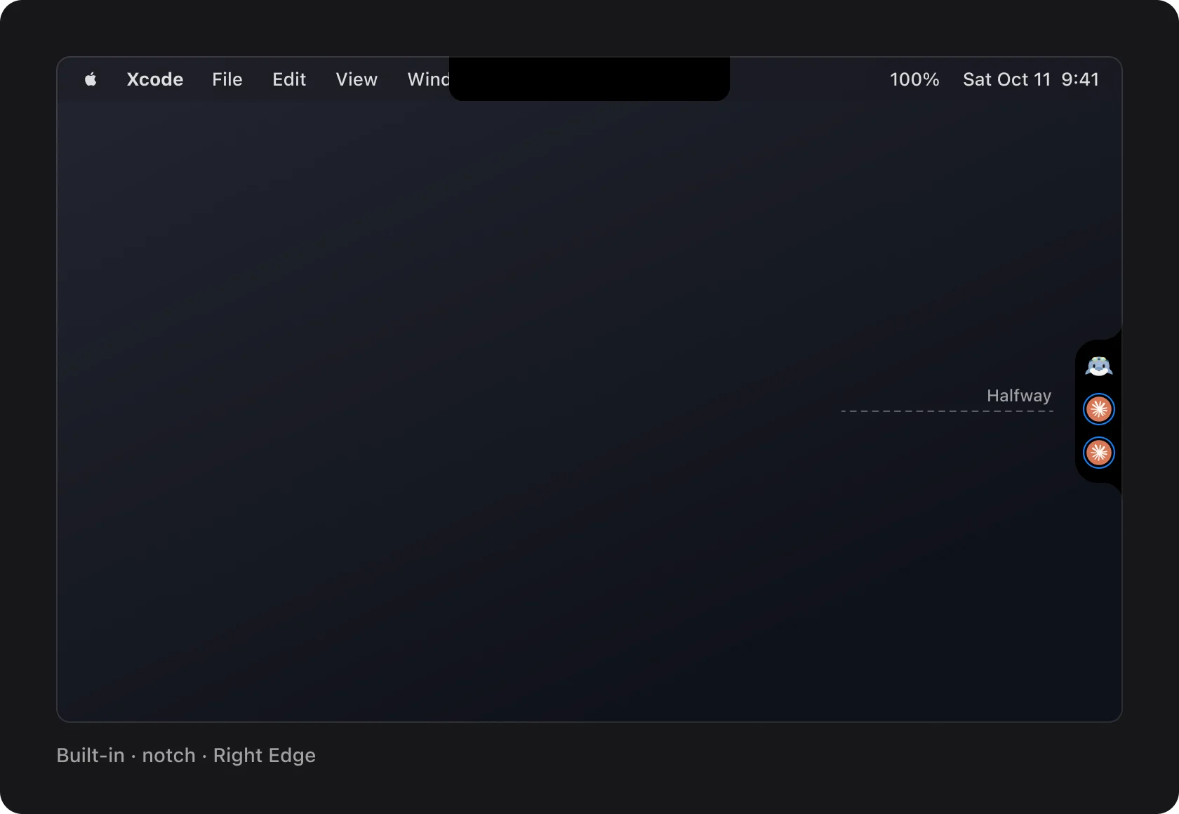
Closed, it's a 34 pt tab flush with the screen edge. The top island's curved shoulders are turned 90 degrees, so it reads as the same object, just moved. Top to bottom: the companion, the agents with their status rings, and +N for the rest.
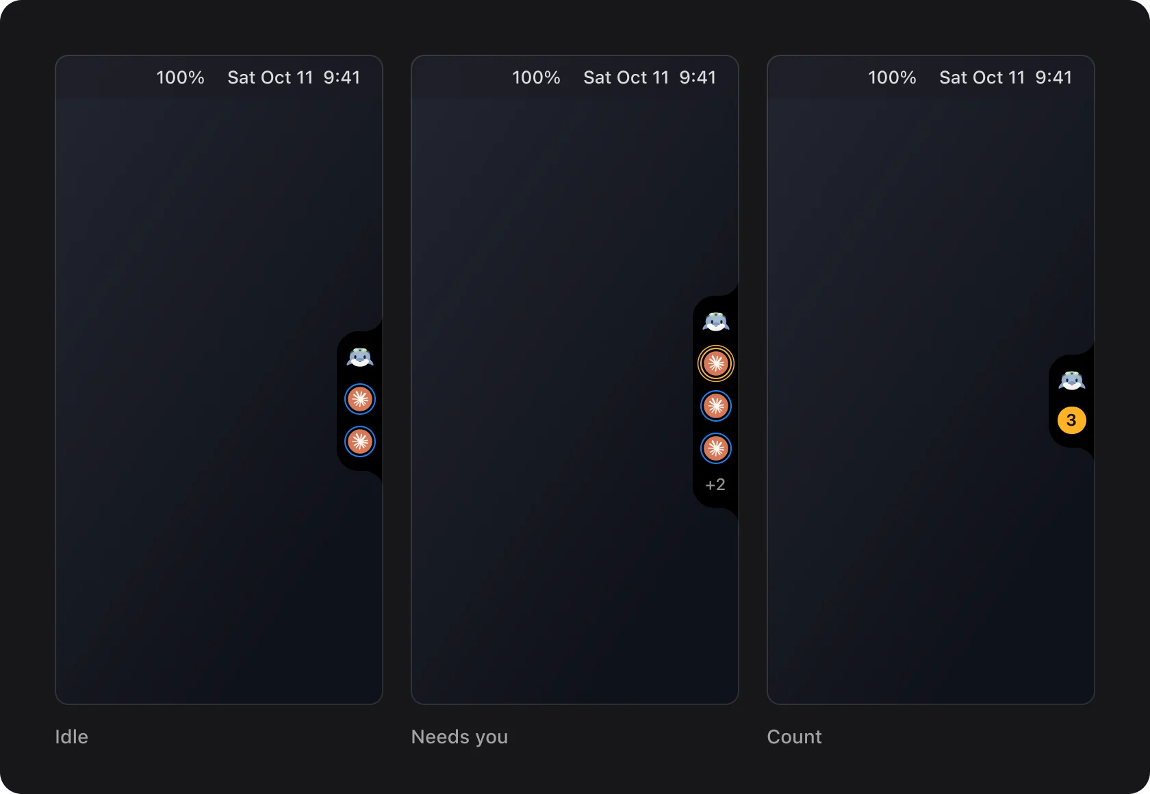
Every state has to fit in 34 pt. When an agent needs you, its icon moves to the top with an amber ring, the companion looks, and the tab gives a small bounce along the edge: 1, 1.06, 0.985, 1 over 620 ms. When several wait, the icons give way to a count, as they do on the top island.
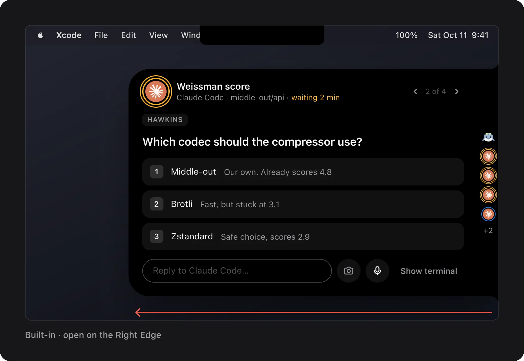
Open, the panel slides out of the tab into the screen. It's the same card and the same 560 pt width as the top island, centred on the tab and kept 8 pt inside the screen. The tab stays as the panel's edge, so tab and panel are one shape. A permission request slides out sideways the same way, with the same keyboard shortcuts. Claude didn't redraw the card: it took it from the approved top island and only changed where it comes from.
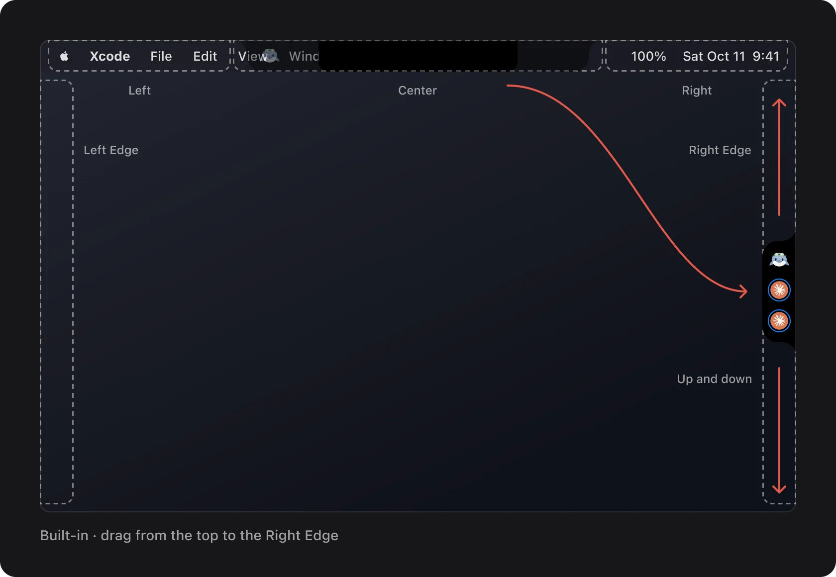
Drag the closed island off the top toward a side, and near the edge it docks as a tab under the pointer. Along the edge it follows the pointer up and down. Drag it back to the top and it snaps to Left, Center or Right again.
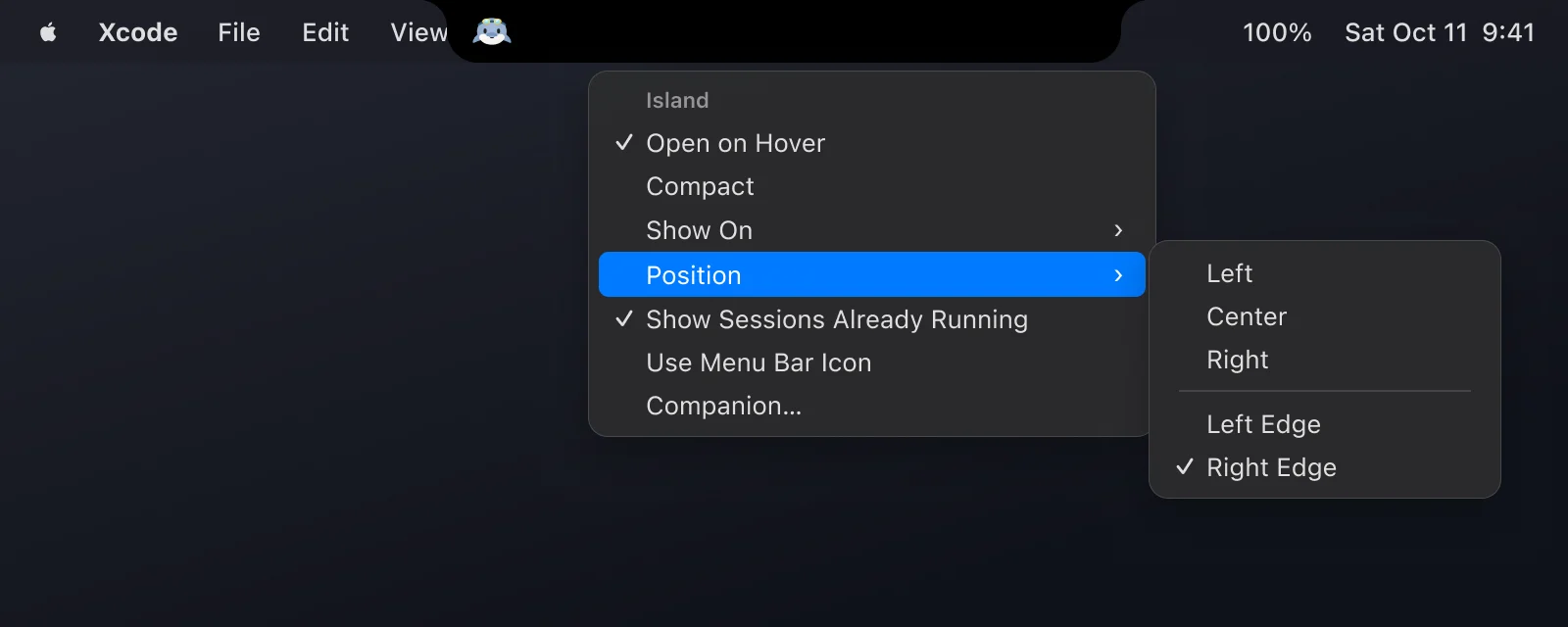
Dragging can't be the only way in. Position gets Left Edge and Right Edge under a separator, so the edges work from the keyboard and with VoiceOver too.
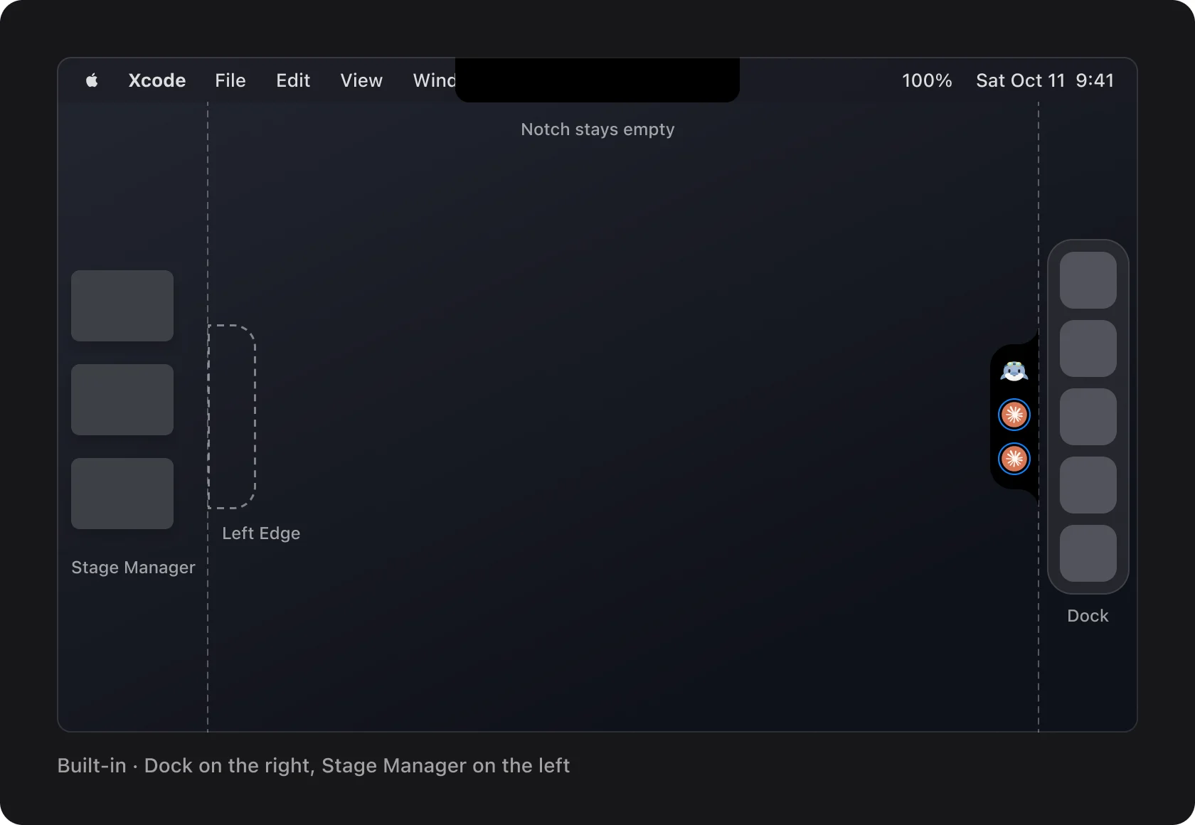
Screen edges are already taken on a lot of Macs. With the Dock on that side, the tab sits beside the Dock. Stage Manager's strip on the left gets the same treatment. And with the island on an edge, the notch stays empty. A clash like this is easier to catch in a frame than in a bug report.
4. Pick between options by their weak spots
When there's more than one good answer, Claude draws each one instead of choosing quietly. Here the open question was whether the tab can sit anywhere along the edge, or only at fixed spots. Each option says why it works and where it's weak, and one is marked Recommended.
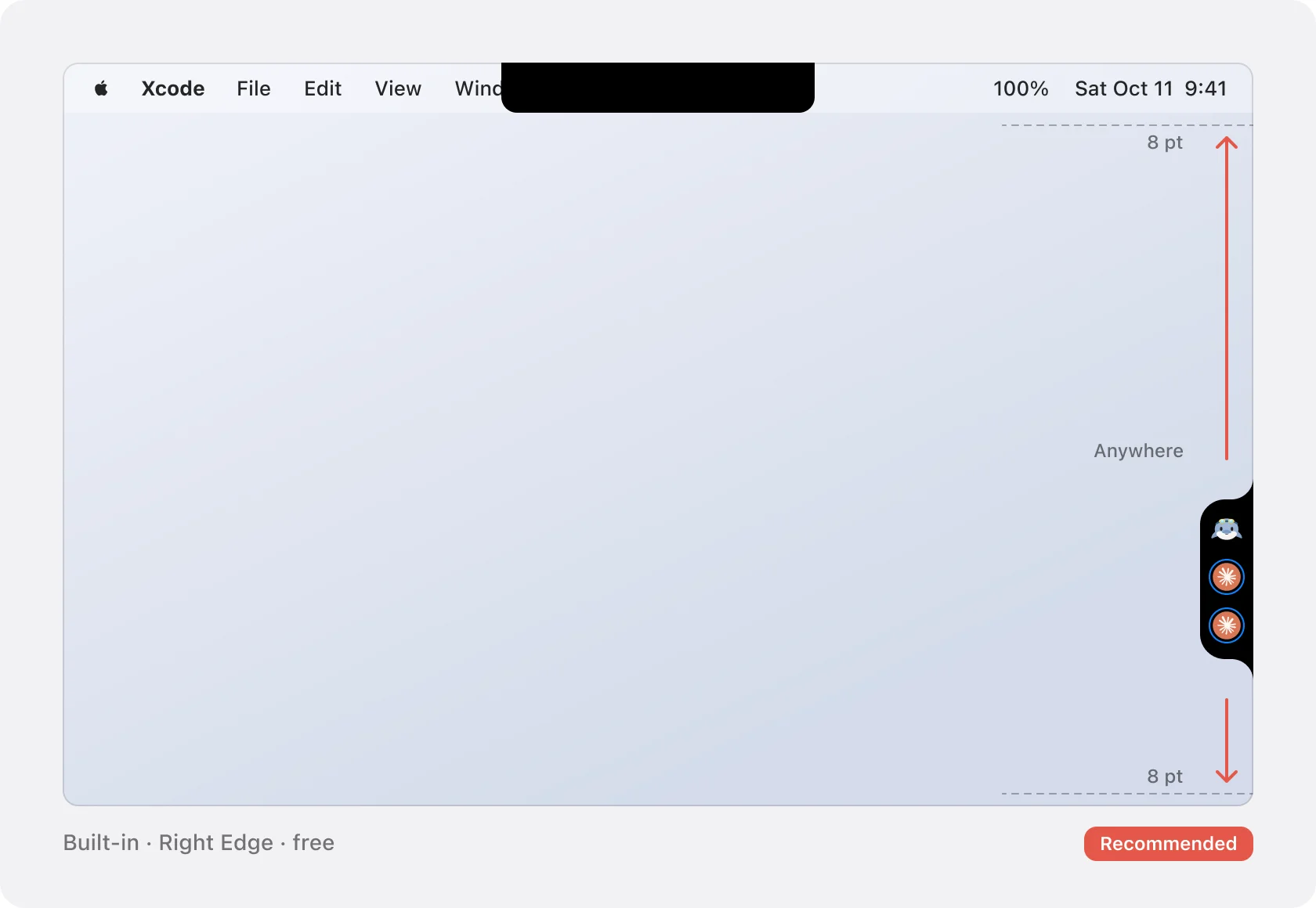
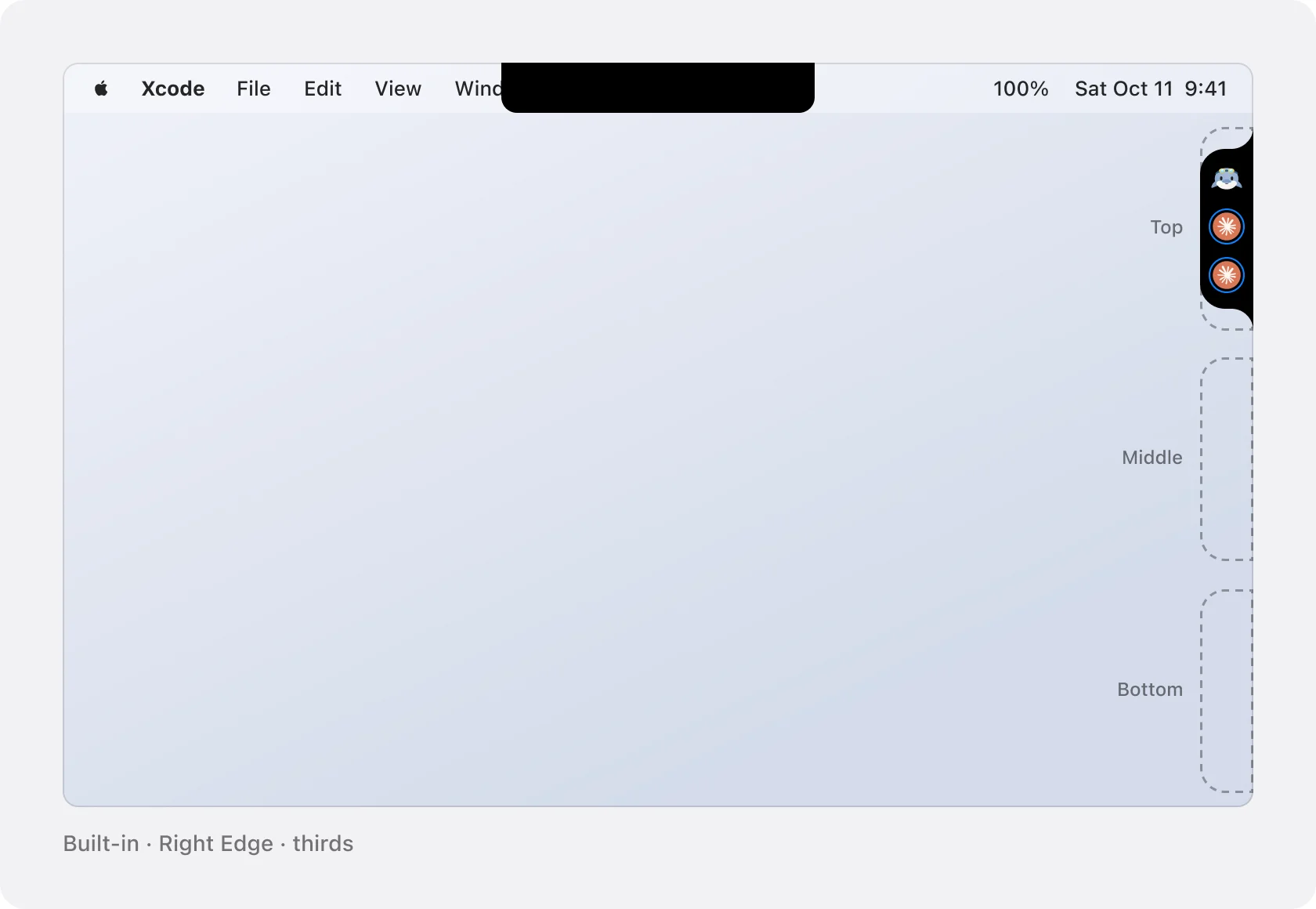
I compare the weak spots, not the strengths. B matches the top edge, but a tab you can't move off your scrollbar is worse than a menu with fewer choices. That's the case for A. The pick is mine, and nothing gets built until I make it.
5. Build from the frames and the notes
Every section ends with a notes frame. Together with the frames, it's the spec the build works from, and it holds the things I'd otherwise find later, in use:
- Motion. Docking glides in 0.25 s ease-out, as on the top, while a spring reshapes the top island into the tab. Opening slides the panel out with the same spring, and the card fades in over 0.24 s after 0.12 s. Closing slides it back into the tab.
- Accessibility. Left Edge and Right Edge are standard menu items, so the keyboard and VoiceOver reach them without dragging. VoiceOver reads the tab as "Coral island, right edge, 1 needs you". Status is never shown by color alone: an agent that needs you moves to the top. With Reduce Motion on, it fades instead of sliding, with no bounce.
- Constraints. The tab stays inside the visible area, beside the Dock or Stage Manager. Each screen keeps its own position.
- To build. The types and functions the build will change. When I approve the frames, that's where Claude starts.
Once I've picked an option, Claude builds from the section. And when the screen changes later, the Figma file is updated to match, so the frames never fall behind the app.
Questions
What do I need to have Claude design in Figma?
Claude Code with Figma's MCP server, which lets Claude write to the canvas. The setup is in How to set up Figma MCP with Claude Code.
Do I need to list the states and edge cases in my ask?
No. I marked the screen's edges and asked for it in Figma. My rules ask for Light and Dark, notes, accessibility, motion and options with a pick. The states, the Dock and Stage Manager, the default spot and the sizes came from Claude.
Why not design straight in code?
Reviewing frames is quicker than reviewing a diff, and Claude can lay out options side by side. Changing a frame is one sentence. Changing code that's already wired up takes longer.
Are these real Coral frames?
Yes, exported from Coral's Figma file. The agent names, tasks and questions are demo copy.